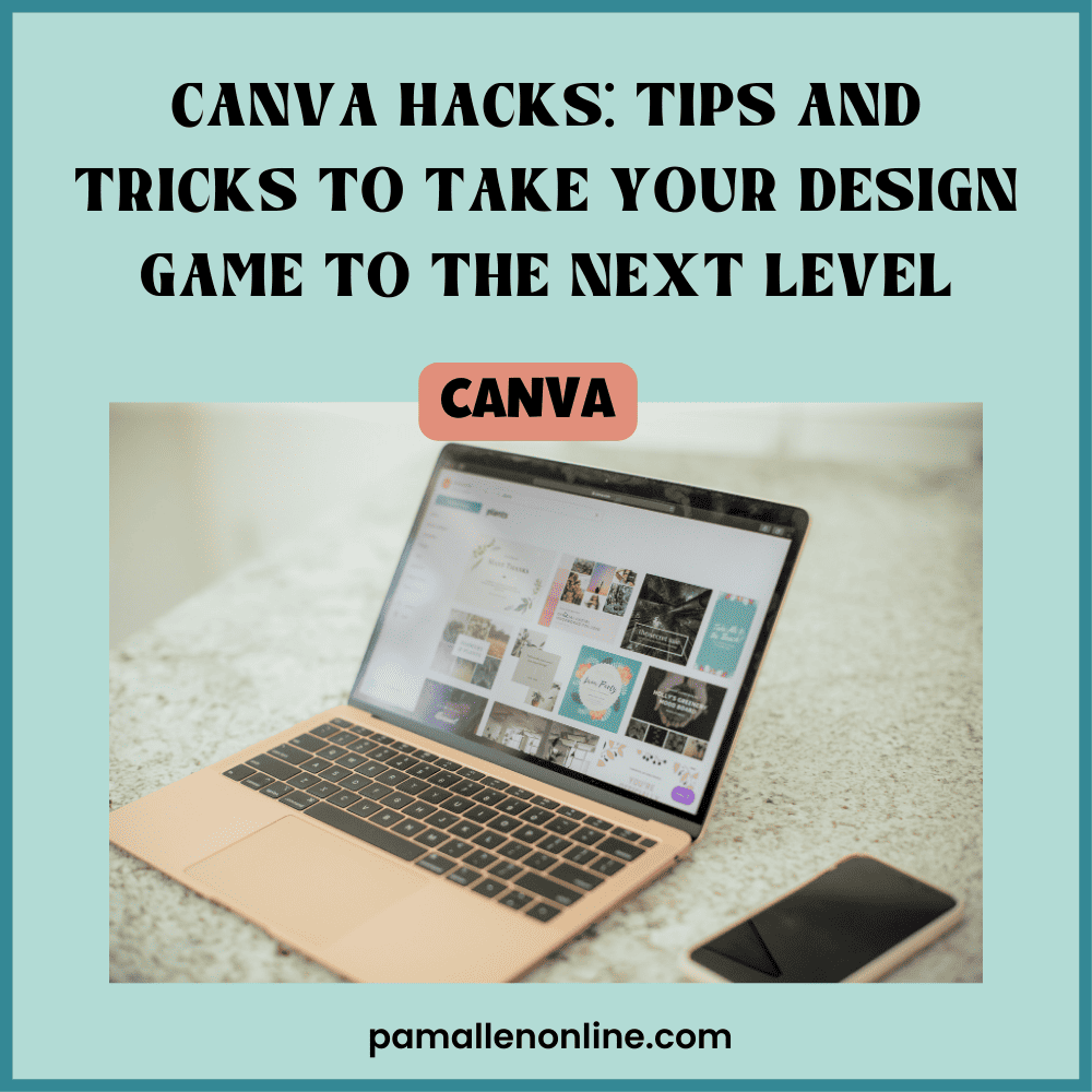
Canva is a user-friendly graphic design tool that allows people to create stunning designs, graphics, and templates without needing advanced skills or expensive software. Its drag-and-drop interface and a vast library of images, fonts, and templates make it an accessible and affordable option for small business owners, marketers, bloggers, and anyone who wants to create eye-catching visuals. In this post, I'll share some of the best Canva hacks and design tips to help you elevate your designs and make the most of this platform.
Tricks and Tips to Enhance Your Design Game
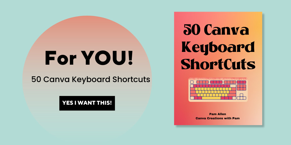
- Use keyboard shortcuts to speed up your workflow.
- Customize your color palette to match your brand.
- Create consistent designs using templates and brand kits.
- Add shadows and effects to make your designs pop.
- Use grids and frames to align elements and create visual balance.
Use keyboard shortcuts to speed up your workflow.
Using Canva shortcuts and tools can significantly reduce the time and effort needed to create designs. With keyboard shortcuts, you can quickly perform common tasks such as copy, paste, undo, and align objects without navigating through menus or using your mouse. This can help you work more efficiently and effectively in Canva. You might not think this will help, but it WILL! Using shortcuts has helped me save time while creating images; those seconds add up, and no matter how simple this is, it is a powerful time saver.
Here are a few main shortcuts:
- Ctrl + D: Duplicate the selected element
- Ctrl + C: Copy the selected element
- Ctrl + V: Paste the copied element
- Ctrl + Z: Undo the last action
- Ctrl + Y: Redo the last undone action
- Ctrl + A: Select all elements on the page
- Ctrl + G: Group the selected elements
- Ctrl + Shift + G: Ungroup the selected group of elements
- Ctrl + E: Align the selected elements to the center of the page
If you want MORE- get my FREEBIE!
Customize your color palette to match your brand.
Did you know that customizing your color palette in Canva can significantly impact your brand's recognition and personality? Using consistent colors across all your designs, you can create a cohesive brand image that's easy to remember and identify. It's like giving your brand a unique fingerprint that sets it apart from the rest. This is probably my favorite thing to do- use a brand kit. I have brand kits for my membership, Facebook group, and blog, and to keep all those organized within their own area- priceless and so worth the Canva Pro price.
But that's not all! Your chosen colors can also help convey your brand's personality and values. If your brand is about adventure and fun, you might want to use bright, bold colors reflecting that spirit. On the other hand, if your brand is all about sophistication and elegance, you might opt for muted and understated colors.
By using colors that align with your brand's message and values, you can create an emotional connection with your audience and make them more likely to trust and relate to your brand. Plus, it just makes your designs look more polished and professional. Go with colors that excite and make you happy.
When you create a design in Canva, consider your brand's color palette and how you can incorporate it into your design. Your brand (and your customers) will thank you for it!

Create consistent designs using templates and brand kits.
Are you tired of spending hours creating designs from scratch only to have them look completely different from each other? Well, fear not! Canva has got your back. Plus, there are SOOOOOO many templates to pick from – now, that might be a bit overwhelming, but I pick what catches my eye.
One of the best features of Canva is its vast library of templates and brand kits. Templates are pre-designed layouts you can customize to fit your specific needs, such as social media posts, flyers, and brochures. On the other hand, brand kits are sets of design elements such as colors, fonts, and logos that you can save and use across multiple designs.
SAVE TIME AND USE TEMPLATES- Change to your brand colors and fonts!
You can create consistent designs that reflect your brand's identity and personality using templates and brand kits. This is important because consistent branding can help establish trust with your audience and make your brand more recognizable.
When you use templates, you don't have to start from scratch whenever you create a new design. You can choose a template that fits your needs and customize it with your brand's colors, fonts, and images. This saves you time and ensures your designs have a consistent look and feel. I create templates for things I use often, so I need to change the image and title- super simple and quick.
Brand kits are also a great way to ensure consistency across your designs. Using the same colors, fonts, and logos across all your designs creates a cohesive brand identity that people will remember and recognize.
Use a template or a brand kit to help create a consistent and polished design that reflects your brand's identity. Your audience will appreciate the consistency, and you'll save time in the process!
Add shadows and effects to make your designs pop.
Canva has various effects that you can use to add depth and dimension to your designs, such as drop shadows, glows, and outlines. These effects can make your designs look more professional and eye-catching. Adding shadows can make text and images appear floating above the page, creating a 3D effect. And by using effects like glows and bevels, you can make elements stand out even more. Using Shadows in my designs is one of my favorite things about Canva. Last month the Shadow element disappeared, and I was upset- yep, and so were many people, so thank you, Canva, for bringing that back!

Just be careful not to overdo it – too many effects can make your designs look cluttered and messy. So, use them sparingly and strategically to make your designs really shine! I mainly use them in promo designs to make the product POP!
Use grids and frames to align elements and create visual balance.
Have you ever looked at a design and felt like something was off but couldn't quite put your finger on it? Chances are, the elements in the design weren't properly aligned. That's where grids and frames come in handy! Canva has a variety of grid and frame options that you can use to ensure that all the elements in your design are perfectly aligned.

Using grids, you can ensure that your text and images are lined up straight, creating a sense of order and structure. And by using frames, you can group elements together and make them appear as one cohesive unit. This can help create visual harmony in your design and make it look more polished and professional. So, next time you're creating a design in Canva, make sure to use grids and frames to ensure that everything is properly aligned and looking its best!
Plus, you can use rulers and guides (1st photo below)-File-View Settings-Show Rulers and Guides. I always have this on because it helps ensure everything is lining up the way you want.
You can also utilize the TIDY UP features to help with the alignment- you click on the 3 DOTS (see below 2nd pic) or go to Position – Tidy Up.

Using these tips and tricks in Canva can really help enhance your design game and make your designs stand out. The keyboard shortcuts save time and effort, allowing you to create more designs in less time. Customizing your color palette and using consistent designs with templates and brand kits can help establish your brand identity and make your designs more recognizable. Adding shadows and effects can give your designs more depth and dimension while using grids and frames can ensure that all the elements are properly aligned. So, the next time you create a design in Canva, try these tips and tricks to take your designs to the next level!
If you want more TIPS and TRICKS, join my Facebook group- Canva Creations with Pam.
Or if you NEED more, I also have a membership that gives you NEXT LEVEL CANVA tips, templates, ideas, products, and community! Check out THE CLUBHOUSE