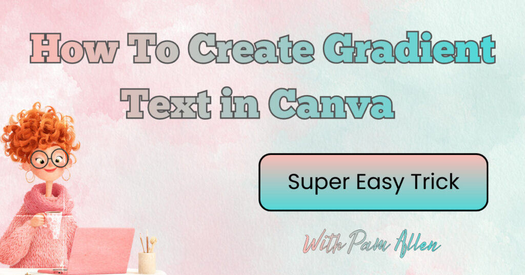
Do you love Canva Tips? Well, you came to the right blog! Stuck on what font to use, or how to make your text pop without spending hours trying things? You are not alone. If you create printables, social graphics, or anything you plan to sell, a few fast tricks inside Canva can save time and make your designs look polished. Today’s roundup walks through simple, practical tips you can try right away. Expect quick wins with font combinations, gradients, mockups, and Canva’s playful new 3D characters and emoji stickers.
What’s New and Fun in Canva Right Now
Canva keeps rolling out small updates that make a big difference. Two that are just plain fun to use:
- 3D characters and emoji stickers: These add personality to pins, covers, worksheets, and product thumbnails.
- Fresh element styles: Little touches like animated stickers or themed graphics help a design feel current fast.
If you have five minutes, open a new design, search “3D characters” or “emoji,” and drag a few onto your canvas. Resize, tilt a tiny bit, and stack them near your headline. You will get instant energy without extra work.
Canva Tip #1 Fast Typography Wins With Font Combinations
When you do not know what font to pick, let Canva help. Instead of scrolling for ages, use the built-in font combos.
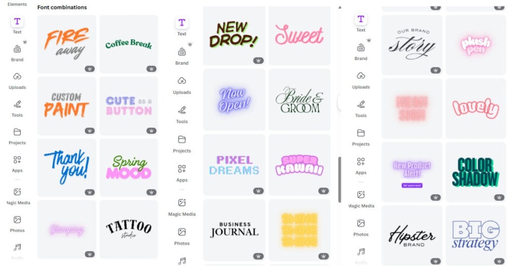
Here is how to find and customize them:
- Open your design, click Text in the left toolbar.
- Scroll to Font combinations.
- Choose a combo you like. Some are Pro, many are free.
- Drop it onto your canvas, then replace the sample text with your words.
- Tweak colors to match your brand or image. You can also open Effects and try Lift for subtle depth.
If you want extra guidance on pairing fonts that look clean and balanced, Canva’s own resources are solid. Skim the Ultimate Guide to Font Pairing for ready-to-use combos and why they work. Prefer a quick, structured walkthrough instead? The Font pairing basics lesson from Canva Design School covers contrast, hierarchy, and common pitfalls.
A simple rule for printables: use one stylish display font for headlines, then a clean sans serif for body text. Keep it to two fonts most of the time for a tidy, professional look.
A quick example that works for printables
- Headline: a bold display font for the worksheet title
- Subhead or labels: a simple sans serif for readability
- Body notes or instructions: the same sans serif at a smaller size
Add spacing between lines and group related items so the page feels calm and easy to scan.
Canva Tip #2: Make Colors Pop With Gradients
Flat color can look a little blah when you want something eye-catching. Gradients give you a soft shift between two colors, which adds dimension without chaos.
Try this workflow:
- Select a shape or text box.
- Click the color swatch in the top toolbar.
- Choose Gradient.
- Canva will auto-pick colors. Replace them with your brand colors or sample hues from your image using the eyedropper.
- Remove extra gradient stops if needed, then adjust the angle or swap which color sits at the start.
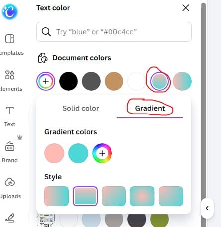
Little changes make a big difference. A coral-to-pink gradient behind a headline can make your worksheet cover feel fresh, while still staying on brand. If the gradient feels too light or washed out, darken one side just a bit so your text has enough contrast.
Canva Tip #3: Mockups That Actually Sell Your Product
Mockups help people see your product in the real world, which boosts perceived value. Canva makes this easy:
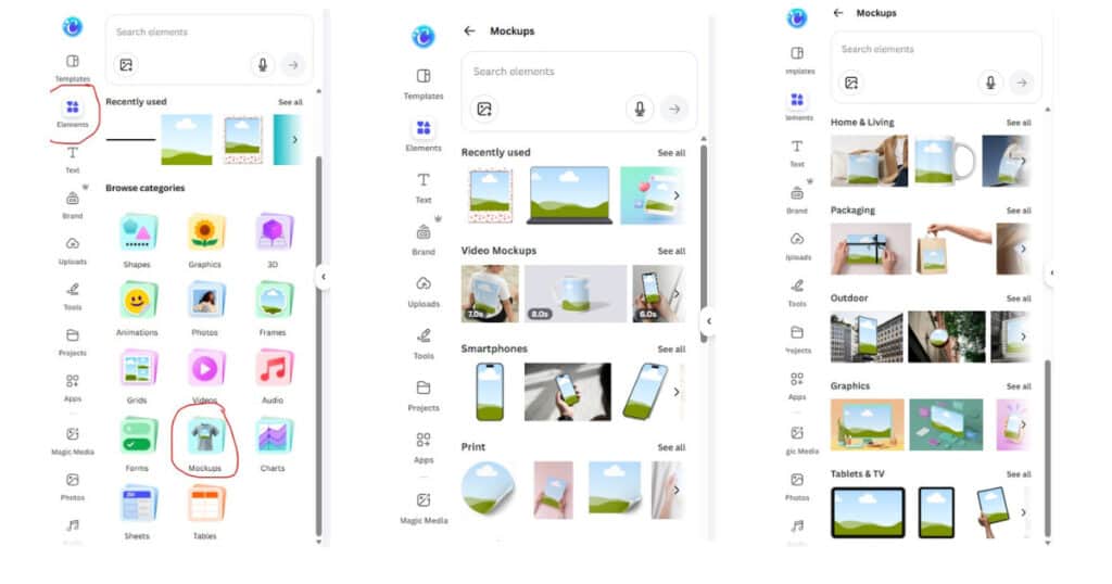
- Upload your file in Uploads.
- Search “mockup” in Elements and choose a frame or device.
- Drop your design onto the mockup frame.
- Adjust shadows or background color to match your brand.
For printable sellers, show a worksheet inside a clipboard, a planner page on a desk, or a bundle displayed as stacked pages. It takes minutes and adds that polished, store-ready look.
A Quick Tour of Elements You’ll Use All the Time
The Elements tab is where most magic happens. Here is a fast cheat sheet for what to reach for:
| Need this | Where to find it in Canva | Why it helps |
|---|---|---|
| Shapes, lines, icons | Elements, then Graphics or Shapes | Build layouts, dividers, and callouts |
| Stickers and 3D items | Elements, search “sticker” or “3D” | Add playfulness and motion |
| Photos and videos | Elements, then Photos or Videos | Quick backgrounds and visual context |
| Charts and tables | Elements, then Charts or Tables | Trackers, habit logs, data visuals |
| Mockups, frames, grids | Elements, search “mockup” or “frame” | Realistic previews and neat image crops |
If you build printables often, get comfortable with frames and grids. They keep your artwork aligned and consistent across page templates, which saves editing time later.
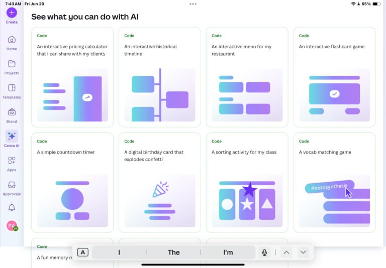
Canva Tip #4: Generate Images and Videos Inside Canva
You can now generate images and even videos without leaving Canva. This is great when you need a quick visual for a cover or a themed bundle.
Try these steps:
- Go to Elements and look for options to generate or create. You will see prompts to describe what you want.
- Type a short prompt, like “pink crown illustration” or “cute watercolor floral border.”
- Let Canva generate options. Pick your favorite, then adjust colors or position as needed.
For videos, you can try a similar flow in the Video section, then place the clip on your canvas. Short looping clips made as a Pinterest idea pin cover or a sales page banner can pull attention fast. If generation takes a while, keep working on your layout or text, then drop the asset in when it is ready.
Tip for prompts: keep them short and clear. Include style words like “watercolor,” “sticker,” or “pastel” to guide the result.
Effects That Add Punch Without Overdoing It
A little goes a long way. These quick tweaks make text and images stand out while keeping your design clean:
- Lift effect on headings: adds a soft shadow for depth.
- Drop shadow under a product mockup: makes it feel grounded.
- Slight tilt on stickers or badges: creates movement without chaos.
- One gradient per page: enough to create contrast, not so much that it feels busy.
Always zoom out and check readability. If you create printables, legibility is the priority. You can be cute and clear at the same time.
Canva Tip #5: Color Matching That Feels Cohesive
Nothing ties a design together like color harmony. Here is a simple workflow:
- Pick a key image, icon, or illustration.
- Use the color picker to sample two or three hues from it.
- Set your text, shapes, and accents to those sampled colors.
- If needed, add one neutral, like a warm gray or soft black, for balance.
This keeps everything cohesive across your printable pages, covers, and promo graphics.
A 10-Minute Workflow You Can Repeat
Use this when you need to make a printable cover, worksheet, or promo graphic fast.
- Start with a blank page in your brand size.
- Add a simple grid or margin guide using shapes.
- Drop in a Font combination that fits your vibe. Replace the sample text.
- Choose a gradient for your headline block or sidebar.
- Add one 3D character or sticker to create a focal point.
- Place your product inside a mockup frame.
- Sample colors from your art and set them as text and accent colors.
- Zoom out to check balance. Adjust sizes and spacing.
- Export and save the design, then duplicate for variations.
Repeat this flow for different printable categories, like habit trackers, meal planners, or kid worksheets. Consistency sells, and a repeatable workflow keeps your brand tight.
Troubleshooting Common Canva Snags
- Text looks off: reduce fonts to two, increase line spacing, and make sure your headline and body text are clearly different sizes.
- Colors feel messy: pull all colors from one source image, then add only one neutral.
- Design looks flat: add Lift to the headline or use a soft gradient behind a key section.
- Not sure what to write: drop a Font combination, keep the structure, and rewrite the words only.
Use Cases for Printable Sellers
- Etsy covers and listing photos: combine a mockup with a gradient banner and a 3D sticker.
- Teacher worksheets: use a friendly display font for the title, a readable sans serif for instructions, and simple icons for steps.
- Planner pages: stick to clean lines, a two-color palette, and a tiny accent sticker to mark important sections.
- Bundle thumbnails: show 3 to 5 page previews in a grid, add one bold headline with Lift, and sample colors from the pages.
Small details stack up. They help your shop feel trustworthy and make buyers confident in your product quality.
Want More Support and Templates?
If you love making products but want shortcuts, come hang out in my community. Join the free Facebook group, Canva Creations with Pam, to share wins, ask questions, and get feedback from people who get it.
If you want ready-to-use designs, check out my membership, The Template Treehouse. You will get PLR and done-for-you templates you can customize, which is perfect for launching new printable packs faster.
The best Canva skills come from play. Try a font combination, drop in a gradient, add a 3D character, and let your eye guide you. Keep it simple and readable, especially for printables. Then layer on small touches that make your work feel fresh. Which tip are you trying first today?
TOOLS I USE
Here are some Facebook Groups to join to help with your Business Growth
- Passive Income Sadie Smiley– learn how blogging can turn into $$ by adding products, courses, and membership
- Teachers Pay Teachers with Beth Ann– Want to Create Educational Printables and SELL THEM!
- Digital Planners with Samantha Stringer Interested in creating Digital Planners?
- WP Basics Guide | WordPress for Beginners Diane will walk you through WP/Kadence.
- Build Digital Product with Amanda Learn how to sell on ETSY
TOOLS I USE!
- My Platform (the heart of my business)Kianis (Try for 30 days for FREE)
- Email- I use Subtrio but also recommend Mailerlite or Flodesk
- Helps me write my BLOG POSTS- Right Blogger
- The Best Hosting service I ever had- BigScoots
- Where I get my domains NameCheap
- I learned how to CREATE an online business- The Passive Income Pathways aka Sadie Smiley (PIPs) is where to start- if you are serious about making money online then sign up for Blog to Membership-LITE MEMBERSHIP